Everyday rooms, considered · 4 minute read
Choosing art for your kitchen
Find a safe spot for kitchen art, work with your cupboard colours and choose prints that bring warmth to breakfast corners and dining spaces.
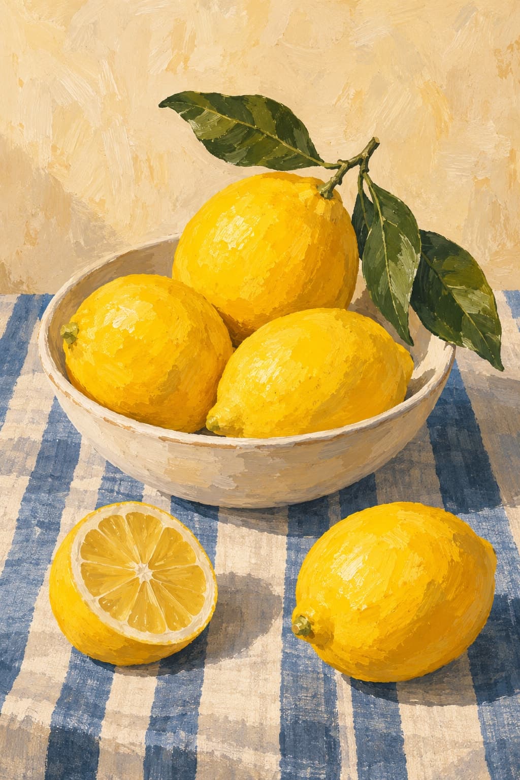
Lemon Table brings a warm yellow note to a kitchen or dining palette.
Find the right spot first
Before choosing a subject, find a wall where paper artwork can live comfortably. A breakfast corner, dining wall or space beyond the busiest work area is usually a better starting point than directly above a hob or beside the sink.
Keep prints away from repeated steam, splashes and direct heat. A glazed frame can provide some protection from everyday dust, but it does not make a paper print waterproof or suitable for a damp spot. Avoid persistent direct sunlight too, which can affect colour over time.
Take your cue from the things already there
Kitchen cupboards, worktops and splashbacks create a strong palette before you add anything to the walls. Choose one colour to echo in the artwork, then look for a second colour that gives it a little contrast.
Warm yellow can bring life to an ivory or pale blue scheme. Olive greens are an easy companion to timber and creamy stone tones. If patterned tiles already do a lot of work, a print with a simpler composition may feel more settled than another dense pattern.
Food is an option, not an obligation
A lemon still life or olive branch makes an immediate connection to cooking and eating. They work particularly well in a small breakfast nook where the subject can be enjoyed up close.
A kitchen can also suit a coastal horizon or a restrained abstract. In an open-plan room, choosing an artwork that relates to the living area can help connect the two spaces. Look at the overall colours and shapes before worrying about whether the subject is conventionally “kitchen art”.
Give a small print a clear place
A small piece feels purposeful when it has a relationship with the furniture. Centre it above a narrow table, place it alongside a dresser or hang a pair on a quiet wall. Make sure the frames will not be knocked by chairs, cupboard doors or people passing.
For shelf styling, use a secure display suited to the frame rather than relying on a precarious lean. Keep the artwork clear of food preparation and allow useful working space around it. A kitchen still needs to work as a kitchen.
- Measure the frame’s outer dimensions before choosing its position.
- Keep paper and frames away from steam, splashes and heat.
- Repeat a colour from a cupboard, tea towel or favourite piece of pottery.
- Use the product listing for exact sizes; room images are styling illustrations.
Make a simple pair
Two prints can give a dining wall more presence without making it feel crowded. Try a still life with a botanical branch, linked by a shared green or cream tone. The images can be different, while matching frame finishes and aligned centres keep the arrangement calm.
Leave enough space between the pieces for each to read clearly. Test the arrangement with paper templates and view it from where you sit at the table. The best choice is the one that makes the room feel more inviting in everyday use.